winklogo200.png

Football History

College Football Helmet History

The 1922 Rose Bowl
Celebrate 2 of the top Gridiron Coaches in history in the latest Pigskin Dispatch book

When Greasy Met the Wonder Coach

Greatest Pro Team
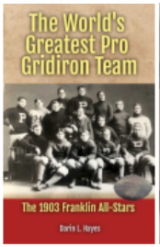
Who was the MOST DOMINANT team in Pro Football History? We have the answer in the latest Pigskin Dispatch book

The World's Greatest Pro Gridiron Team

FREE Daily Sports History
You are only seconds away from receiving the Pigpen's Newsletter everyday filled with new items

SUBSCRIBE BY CLICKING _________________________  

College Football Helmet History

Today's college football players charge down the field adorned in futuristic helmets, marvels of modern engineering designed to absorb impact and mitigate injuries. But rewind the clock a century, and you'd find players taking the field with little more than glorified leather skullcaps. This series delves into the fascinating evolution of college football helmets and head gear, a journey that mirrors not just the changing safety standards of the sport, but also its cultural and technological advancements.

Join us we embark on the individual hard shell histories of individual schools and how the design has progressed for each over the ages.


Results 61 thru 70 of 121 for "College Football Helmet History"
Go To Page: 1 2 3 4 5 6 7 8 9 10 11 12 13

Texas Christian Horned Frogs Helmet Design History

The TCU Horned Frogs football helmet has undergone a number of changes over the years, reflecting the evolution of the sport and the team's identity. The early helmets were simple leather shells with no padding, offering little protection to players. As the game became more dangerous, helmets began to incorporate padding and face masks.

In the 1960s, TCU adopted a purple and white helmet with a large "TCU" logo in the center. This design remained largely unchanged for several decades, becoming one of the most recognizable in college football. In the 1990s, TCU began experimenting with different helmet designs, including a black helmet with a white "TCU" logo. This design was short-lived, and the team eventually returned to its traditional purple and white look.

In recent years, TCU has made several updates to its helmet design, incorporating new technology and materials to improve player safety. The team has also experimented with different helmet graphics and decals, including a horned frog logo and the number "2" to represent the program's two national championships.

The TCU Horned Frogs football helmet is a symbol of the team's rich history and tradition. It has evolved over the years to reflect the changing landscape of the sport, while still maintaining its iconic purple and white colors.

UL Monroe Warhawks Helmet Design History

The University of Louisiana Monroe Warhawks football team has a rich history, reflected in their iconic helmet design. The Warhawks' helmets have typically featured a bold, crimson color, symbolizing the passion and intensity of their program. The primary logo on the helmets is often a fierce-looking hawk, representing the team's name and their aggressive style of play.

Over the years, the Warhawks have experimented with various helmet designs and color schemes. Some iterations have included additional details or accents, such as stripes or patterns, to enhance the overall aesthetic. However, the core elements of the crimson color and the hawk logo have remained consistent, serving as a recognizable symbol of the ULM football program.

In 2024 a white shell adorned with a semblance of the World War II snarling teeth and eye pays homage to the WWII veterans flying aces.

The Warhawks' helmet design has evolved alongside the team's successes and challenges. As the program has grown and achieved greater recognition, the helmet has become a more prominent and iconic piece of their identity. The enduring appeal of the Warhawks' helmet design is a testament to the team's history, tradition, and unwavering spirit.

BYU Cougars Helmet Design History

The BYU Cougars football helmet has undergone several changes throughout its history, reflecting the evolving identity of the team and the university. In the early years, the helmets were simple, often featuring a plain white or blue shell with a small BYU logo. As the team gained prominence, the helmet design became more elaborate, incorporating new colors and stripes.

One of the most significant changes came in the 1980s when the Cougars adopted a new logo featuring a stylized "Y" and a cougar head. This logo was incorporated into the helmet design, becoming a prominent feature. In the 1990s, the Cougars experimented with different helmet designs, including a chrome finish and a matte black look.

In recent years, the BYU Cougars have maintained a consistent helmet design, featuring a blue shell with a white stripe down the middle and the iconic "Y" logo on the sides. This design has become synonymous with the team and is recognized as one of the most distinctive in college football.

The BYU Cougars football helmet design history is a reflection of the team's journey and evolution. From humble beginnings to a modern-day icon, the helmet has played a significant role in shaping the team's identity.

Texas State Bobcats Helmet Design History

The Texas State Bobcats football program has a rich history, reflected in the evolution of their iconic helmet design. The helmet's primary color has remained a steadfast maroon, symbolizing the university's ties to the Lone Star State. However, the logos and accents have undergone changes over the years.

In the early days of the program, the helmet featured a simple maroon design with a white outline. As the team gained prominence, a stylized bobcat head was introduced to the center of the helmet. This logo, often depicted in a fierce, snarling pose, became a recognizable symbol of the Bobcats. In the late 20th century, a more modern and streamlined version of the bobcat head was adopted, incorporating elements of the university's official seal.

To complement the bobcat logo, various accents and stripes have been used on the helmet. White stripes and decals have been common features, providing a contrasting element to the maroon background. In recent years, the Bobcats have experimented with different helmet designs, including matte finishes and special edition helmets for specific games. These variations have added a dynamic and contemporary touch to the team's overall appearance.

Colorado Buffaloes Helmet Design History

The Colorado Buffaloes football team has a long and storied history, and their helmet design has been a constant throughout their journey. The iconic golden helmet, adorned with the silhouette of their beloved mascot, Ralphie the Buffalo, has become a symbol of the program.

The helmet's color scheme has remained consistent over the years, with gold as the primary color, representing the state's rich mineral resources. This is paired with black, which adds a touch of sophistication and contrast. The "CU" cutout within Ralphie's silhouette is a subtle nod to the university's name and has been a feature of the helmet for decades.

The shade of gold has varied from a straight gloss version to a metallic, goldleaf shell base color. Recent version of the headgear have seen glos and matte black shells with a gold logo, and even gray and white base shells with goldm gray and black "Ralphies" on the side.

While there have been minor variations in the design over time, such as changes in the helmet brand or the addition of decals, the core elements have remained unchanged. The Colorado Buffaloes helmet is a testament to the program's tradition and a symbol of the state's pride.

New Mexico Lobos Football Helmet History

Posting University of New Mexico Lobo Football history content. Protect the past, present, and future of Lobo Football. #Win5 — twitter.com

The New Mexico Lobos football program, like many others, has likely undergone several helmet design changes over the years. It's common for teams to experiment with different colors, stripes, and logos to create a distinctive look. Early helmets were often simple, featuring only the team's primary color and a basic logo.

As helmet technology advanced, so did the designs. The introduction of new materials and paint techniques allowed for more intricate graphics and patterns. It's plausible that the Lobos have incorporated elements of New Mexico's culture and landscape into their helmet designs, such as desert-inspired colors or symbols. Additionally, the team may have adjusted their helmet look to align with broader uniform changes or to commemorate specific milestones or eras in the program's history.

Houston Cougars Helmet Design History

The Houston Cougars football program has undergone a series of visual transformations throughout its history, with the helmet serving as a prominent emblem. The early days of the program featured simple, often plain helmets, common to the era. As the sport evolved and became more visually oriented, so too did the Cougars' headgear.

A significant shift occurred in the late 20th century, with the introduction of bolder designs and colors. The classic red helmet with a white "C" became an iconic representation of the program. This design resonated with fans and established a strong visual identity. In more recent years, the Cougars have experimented with variations on this classic theme, incorporating different shades of red, adding stripes, or altering the "C" logo.

While these changes have injected fresh energy into the program's appearance, the core elements of the helmet design have remained consistent, ensuring a strong connection to the team's heritage. As the Cougars continue to evolve on and off the field, it will be interesting to see how their helmet design adapts to future trends while preserving the essence of their tradition.

Eastern Michigan Eagles Helmet Design History

2019-Current 2019 Games 1, 3, 11 2020 Games 2, 4-5 ​2021 Games 2, 4-5, 9-10 ​Numbers removed from front of helmet 1st Photo — www.helmethistory.com

The Eastern Michigan Eagles football helmet has undergone a relatively modest evolution compared to many other programs. While specific details of every iteration might be limited, general trends can be observed.

Early helmets were likely basic, single-color models, probably green to match the school colors. As the sport and protective equipment advanced, so too did the Eagles' headgear. The introduction of decals and facemasks added complexity, allowing for more distinctive designs. In recent years, there has been a push for increased safety, with helmet technology becoming more sophisticated. While Eastern Michigan has likely adopted these advancements, the core design—predominantly green with the Eagles logo—has remained consistent, fostering a sense of tradition and identity.

Boise State Broncos Helmet Design History

Boise State University's football team, the Broncos, is renowned for their innovative and eye-catching uniform designs. Their helmets are no exception, featuring a variety of unique color schemes and designs that have become synonymous with the program.

One of the most iconic Boise State helmet designs is the "blue turf" helmet, which features a blue shell with a white outline and a small Bronco logo on the side. This design pays homage to the team's signature blue field, which has become a national landmark. Another popular design is the "smoky mountain" helmet, which features a dark blue shell with a white outline and a mountain range design on the side. This design is a nod to the surrounding mountains and the rugged beauty of the Idaho landscape.

The shell colors have been in white, blue, matte black, and even orange, with varying logos that have stretched from horse heads, the bucking stallions, the word "Broncos" in script and even player jersey numbers, for an old-school feel.

No matter whether it is the Boise State field or helmets, your eyes will be enamored with a colorful display, unique in design.

Boston College Eagles Helmet Design History

The Boston College Eagles football helmet has undergone a relatively consistent evolution compared to many other programs. The foundation of the design has remained largely unchanged, showcasing a classic and traditional aesthetic.

The helmet's primary color is maroon, a staple of the Boston College color scheme. This consistent base allows for variations in accents and decals without drastically altering the overall look. Over the years, the Eagles have experimented with different shades of maroon, but the core color has remained steadfast.

While the helmet's shape and color have remained consistent, the decals and logos have seen some variation. The iconic gold eagle, a symbol of the university, has been a prominent feature on most helmets. However, the size, placement, and style of the eagle have evolved over time. Additionally, the team has occasionally incorporated other elements, such as stripes or wordmarks, to add visual interest.

Overall, the Boston College Eagles helmet design has maintained a strong sense of tradition while incorporating subtle changes to keep the look fresh and modern.
Results 61 thru 70 of 121 for "College Football Helmet History"
Go To Page: 1 2 3 4 5 6 7 8 9 10 11 12 13

Orville Mulligan: Sports Writer
We invite you to take a ride through 1920's sports history in the audio drama that takes the listener through the sounds and legendary events of the era through the eyes of a young newspaper journalist. You will feel like you were there! Brought to you by Number 80 Productions and Pigskin Dispatch _________________________

Proud to Support The Professional Football Researchers Association
To learn more about joining the fun in preserving football history go to The Official PFRA Website. _________________________
We have placed some product links on this page. If you purchase by clicking on them, we will get a commission to use to help with operating costs.

Sports Jersey Dispatch
If you like remembering players of the NFL by their numbers then you may also enjoy going uniform number by number in other team sports as well. We have it for you on our other website in baseball, basketball, hockey and more on the Sports Jersey Dispatch. _________________________

Sports History Network
A Proud Partner in the Headquarters of Sports Yesteryear, SHN. _________________________

Bears versus Cardinals: The NFL's Oldest Rivalry
Author Joe Ziemba the master historian of football in Chicago has released another beauty. It is titled Bears versus Cardinals: The NFL's Oldest Rivalry. _________________________