winklogo200.png

Football History

College Football Helmet History

The 1922 Rose Bowl
Celebrate 2 of the top Gridiron Coaches in history in the latest Pigskin Dispatch book

When Greasy Met the Wonder Coach

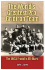
Greatest Pro Team
Who was the MOST DOMINANT team in Pro Football History? We have the answer in the latest Pigskin Dispatch book

The World's Greatest Pro Gridiron Team

FREE Daily Sports History
You are only seconds away from receiving the Pigpen's Newsletter everyday filled with new items

SUBSCRIBE BY CLICKING _________________________  

College Football Helmet History

Today's college football players charge down the field adorned in futuristic helmets, marvels of modern engineering designed to absorb impact and mitigate injuries. But rewind the clock a century, and you'd find players taking the field with little more than glorified leather skullcaps. This series delves into the fascinating evolution of college football helmets and head gear, a journey that mirrors not just the changing safety standards of the sport, but also its cultural and technological advancements.

Join us we embark on the individual hard shell histories of individual schools and how the design has progressed for each over the ages.


Results 51 thru 60 of 126 for "College Football Helmet History"
Go To Page: 1 2 3 4 5 6 7 8 9 10 11 12 13

Helmet History of the Akron Zips

The Akron Zips football helmet, bearing the iconic zipper logo, is a prominent symbol of the university's athletic history. But its design hasn't always been the sleek, modern version we see today. Let's delve into the fascinating journey of the Zips helmet, a story of evolution, creativity, and unwavering team spirit.

Early Days (1925-1947):

-Humble Beginnings: In the early years, the Zips lacked a unified helmet design. Players sported various styles, from leather domes to cloth caps, often adorned with simple lettering or the occasional rubberized "A."

-The Birth of the Zipper: In 1925, Akron students chose "Zips" as the university's nickname, inspired by the popular "zipper" overshoes made by the local B.F. Goodrich Company. However, it wasn't until 1947 that the zipper motif appeared on the helmet.

Taking Flight (1947-1972):

-The Soaring Zip: The first official Zips helmet featured a bold blue color with a single white zipper slashing across the top, resembling a bird in flight. This "Soaring Zip" design, with its dynamic energy, quickly became a fan favorite.

-Variations on a Theme: Throughout the next few decades, the Soaring Zip saw minor tweaks. The zipper's shape changed slightly, and the helmet incorporated stripes and additional detailing.

A New Era Dawns (1973-Present):

-Modern Update: In 1973, the Zips underwent a major rebranding. The team colors shifted to blue and gold, and the helmet received a significant makeover. The zipper became thicker and more stylized, featuring angular teeth and a bolder outline.

Enjoy the helmet design history of the Akron Zips from Blaise D'Sylva's presentation of images of the Zips headgear throughout the team's history.

A Journey Through Tennessee Helmet History

For Tennessee Volunteers fans, the football helmet isn't just headgear; it's a canvas brimming with symbolism and stories etched in paint and stripes. Tracing its evolution reveals a captivating narrative of team identity, evolving trends, and a never-fading orange flame.

In the early days, simplicity reigned. From 1925 to 1950, a plain white shell adorned with a single orange stripe down the center served as the Vols' headwear. It was a modest symbol, yet it boldly declared their allegiance to the color that would become their trademark.

The 1950s ushered in a change. Orange numbers were added, emblazoned on either side, further strengthening the team's visual identity. But it wasn't until 1964 that the iconic "Power T" arrived, a bold black block letter emblazoned proudly on the helmet's crown. This symbol, designed by new coach Doug Dickey, instantly resonated with fans, solidifying the team's image as a force to be reckoned with.

The T wasn't static. Over the years, it underwent subtle tweaks, reflecting the changing aesthetic of the era. The stripe narrowed, then widened, the font adjusted, constantly searching for the perfect visual representation of Vol power.

In 2015, Nike entered the scene, bringing a bold rebrand. The Power T received a slight reshaping, gaining a modern edge, and the helmet sported a checkerboard design on the back, mimicking the Neyland Stadium end zone. This change sparked debate, some embracing the fresh look, others pining for the classic simplicity.

But one thing remained constant: the orange. Throughout the decades, from the white shell to the checkered accents, the vibrant orange has never wavered. It's a constant reminder of the Vols' fiery spirit, a beacon that shines even in the darkest of defeats.

Oklahoma State Cowboys Helmet Design History

The Oklahoma State Cowboys football helmet design boasts a rich history, reflecting the evolution of both the sport and the team's identity. From its humble beginnings to its current iteration, the helmet has served as a symbol of pride and tradition for Oklahoma State players, fans, and alumni.

Early Oklahoma State football helmets were likely made of leather and offered minimal protection to players. As the game became more physical and safety concerns grew, the helmets transitioned to sturdier materials like hard plastic. It was during this era that the iconic orange base color, a hallmark of Oklahoma State athletics, began to be prominently featured on the helmets.

A defining feature of the Oklahoma State helmet is the presence of a spear-like logo on either side. This logo, known as the "Pistol Pete" logo, pays homage to the school's mascot, a character modeled after a fictional Wild West outlaw. The introduction of the Pistol Pete logo in the 1920s added a distinctive element to the helmet design and solidified its connection to the Oklahoma State brand.

Over the years, the Oklahoma State Cowboys helmet design has undergone subtle refinements. Material advancements have led to the use of lighter, more protective shells. Facemask designs have also evolved to enhance player safety. However, the core elements – the orange base color and the Pistol Pete logo – have remained constant, serving as a testament to the team's enduring traditions.

The Oklahoma State Cowboys football helmet design is more than just a piece of equipment; it's a symbol of identity. It represents a legacy of athletic excellence, passionate fandom, and a shared history that unites generations of Cowboys faithful.

California Golden Bears Helmet Design History

2017-19; 2021 2017 Game 4 2018 Game 6 2019 Game 10 ​2021 Game 12 Same helmet as 1976-77 and 2007 Game 10 — www.helmethistory.com

The Cal Golden Bears, the University of California, Berkeley's athletic teams, have a rich history of football excellence, and their helmet design has been a constant element throughout their legacy. The Bears' signature color scheme of blue and gold has remained consistent over the years, symbolizing the university's academic excellence and the state's natural beauty.

While the color scheme has remained steadfast, the helmet's design has evolved over time. In the early days, the Bears wore simple helmets with a single stripe down the center. As the team's popularity grew, so did the complexity of their helmets. The iconic "Script Cal" logo, featuring the university's initials in a flowing script, became a staple on the Bears' helmets, often adorned with a bear head or paw print.

The base shell colors have variesd from the mustard gold color, to white, matte black and even a season of gloss black helmets. The logo adorning the side has varied as well including the white block letter "C" enveloped in a dark blue oval, the the word"Cal" written in script.

The stripes down the middle had a very unique arrow shaped design at some points during the early 2000's and 2010s.

In recent years, the Bears have experimented with various helmet designs, including throwback uniforms that pay homage to their historical roots. However, the "Script Cal" logo has remained a constant, a symbol of the team's tradition and identity.

Indiana Hoosiers HelmetHistory.com

A History of the Hoosier Helmet
The Indiana Hoosiers football helmet has undergone a series of transformations over the years, reflecting the evolving identity of the program. While not as iconic as some of its Big Ten counterparts, the Hoosier helmet has nonetheless played a role in the team’s visual story.  

Early iterations of the Hoosier helmet were simple, often featuring a solid color with minimal striping. As the sport evolved, so too did helmet designs, with Indiana adopting the classic “Block I” logo, a staple of the program for decades. This era also saw experimentation with helmet colors, including lighter shades of crimson.  

The 1980s brought a significant change with the introduction of a more aggressive pitchfork logo. However, this design was short-lived, replaced by a return to the Block I under Coach Bill Mallory. The late 1990s saw another departure from tradition with a black helmet featuring a circular IU logo, a brief experiment that ultimately gave way to the familiar crimson helmet with the Block I.  

In recent years, Indiana has sought to modernize its look while honoring tradition. The program has introduced alternate helmets, including white with a crimson stripe, and experimented with different shades of crimson. While these changes have generated discussion among fans, they reflect a desire to stay relevant in a visually driven sporting landscape.  

Ultimately, the Indiana Hoosiers helmet is a canvas upon which the program’s identity is painted. As the team continues to evolve, so too may its headgear, but the core elements of Hoosier pride and tradition will always be at the heart of its design.

Stanford Cardinal Helmet Design History

Stanford University, a prestigious institution in California, has a rich history in collegiate football. Its helmet design, logos, and color scheme have evolved over time, reflecting the university's identity and the changing landscape of sports.

Early Stanford helmets were simple, often featuring a plain white or cream color. Mainly white as plastic helmets arose to replace the leather headgear of old, the shells were often un-adorned save a couple of crimson stripes down the middle or an occasional season with the player number plastred to the helmet sides.

As societal attitudes shifted, the original Indian mascot was gradually phased out, and Stanford transitioned to a new symbol, the "Cardinal Tree." This iconic tree, representing the university's location in Palo Alto, California, became a central feature on Stanford's helmets.

In terms of color scheme, Stanford has consistently maintained a cardinal red as its primary color. This bold hue has come to be synonymous with the university and its athletic teams. To complement the red, Stanford has experimented with various secondary colors over the years, including white, gold, and black. These color combinations have helped to create a visually distinctive and memorable look for the Stanford football program.

As the sport of football has evolved, so too has Stanford's helmet design. The university has incorporated modern technology and materials to enhance player safety and performance. While the core elements of Stanford's helmet design have remained consistent, the specific details and features have been updated to reflect the contemporary era of college football.

Rice Owls Helmet Design History

The Rice Owls football helmet has undergone a long and interesting evolution, reflecting the changing styles and safety standards of the sport. Early helmets were simple leather caps with no real protection. As the game became more dangerous, helmets began to incorporate more padding and materials.

The iconic Rice Owls helmet, with its white shell and blue stripe, is a classic design that has remained largely unchanged for decades. The helmet is a symbol of the team's tradition and history. The Owls have also experimented with different helmet designs over the years, such as a chrome helmet in the 1980s and a matte black helmet in recent years.

As helmet technology continues to evolve, the Rice Owls will likely continue to update their helmets to reflect the latest safety standards. However, the team's commitment to its classic design ensures that the Rice Owls helmet will remain a recognizable and iconic part of the team's identity.

In Summary

The Rice Owls football helmet has evolved from a simple leather cap to a modern piece of protective equipment. The team's iconic white helmet with a blue stripe is a classic design that has remained largely unchanged for decades. However, the Owls have also experimented with different helmet designs over the years, such as a chrome helmet in the 1980s and a matte black helmet in recent years. As helmet technology continues to evolve, the Rice Owls will likely continue to update their helmets to reflect the latest safety standards. However, the team's commitment to its classic design ensures that the Rice Owls helmet will remain a recognizable and iconic part of the team's identity.

Miami Hurricanes Helmet Design History

The Miami Hurricanes football helmet has undergone several changes throughout its history, reflecting the evolution of the team's identity and the sport itself.

In the early years, the Hurricanes wore simple helmets with a single green stripe down the center. As the team gained prominence, they began to experiment with different designs, incorporating orange and white accents. The iconic interlocking "U" logo, representing the University of Miami, was eventually added to the helmets, becoming a signature element of the Hurricanes' identity.

Throughout the 1980s and 1990s, the Hurricanes experienced a golden age of football, winning multiple national championships. During this period, the helmet design remained relatively consistent, with the interlocking "U" logo becoming increasingly prominent. The team also experimented with different helmet colors, including orange and black, but ultimately reverted to the traditional green and orange scheme.

In recent years, the Hurricanes have continued to evolve their helmet design, incorporating modern elements while maintaining the core identity of the team. The interlocking "U" logo remains a central feature, but the overall design has become sleeker and more streamlined. The team has also experimented with different helmet finishes, including matte and metallic finishes, adding a touch of innovation to the classic design.

The Miami Hurricanes football helmet is a symbol of the team's rich history and enduring legacy. It has evolved over time, reflecting the changing landscape of the sport while maintaining the core elements that define the Hurricanes' identity.

Iowa State Cyclones Helmet Design History

The Iowa State Cyclones football helmet has undergone a fascinating evolution, reflecting the changing landscape of football equipment and the team's evolving identity. Early Cyclones helmets were simple leather shells, offering minimal protection to players. As the sport became more complex and demanding, helmet design evolved to prioritize safety and performance.

The introduction of plastic helmets in the 1950s marked a significant advancement, providing greater durability and shock absorption. The Cyclones adopted this new technology, incorporating their iconic cardinal and gold colors into the design. The iconic "Cy" logo, featuring a stylized depiction of a cyclone, became a prominent feature on the helmets, symbolizing the team's spirit and ferocity.

Throughout the decades, Iowa State's helmets underwent subtle modifications, incorporating advancements in helmet technology. The emphasis on player safety led to the development of more advanced padding and shell materials, reducing the risk of head injuries. The Cyclones also experimented with different helmet designs and stripe patterns, seeking to create a distinctive and visually appealing look.

Today, the Iowa State Cyclones wear modern helmets that blend tradition with innovation. The iconic "Cy" logo remains a central element, while the helmet's design incorporates cutting-edge technology to enhance player safety and performance. The evolution of the Iowa State Cyclones football helmet reflects the team's rich history and its commitment to progress and innovation.

Helmet Design History

The Washington State Cougars football program has a rich history, and its helmet design has evolved over the years, reflecting the school's identity and the changing trends of the sport. The Cougars' helmets have traditionally featured a crimson color, a shade that has become synonymous with the university. This crimson hue is believed to be inspired by the state's natural beauty, particularly the vibrant sunsets often seen in the Pacific Northwest.

Over the years, the Cougars have experimented with various helmet designs, but the crimson color has remained a constant. There have also been plenty of seasons and games where the shells have ranged from silver, gray, and black with either the school's logo, the wording "WAZZU", of a script "Cougars" adoring them.

In recent decades, the team has incorporated elements such as decals and logos to add a modern touch to their helmets. These decals often feature the Cougars' iconic "W" logo or other school symbols. Additionally, the team has occasionally worn alternate helmets with different designs or color schemes, creating a sense of excitement and novelty for fans.

While the Cougars' helmet design has undergone changes, the crimson color has remained a defining characteristic of the program. This enduring tradition serves as a connection to the school's history and a source of pride for fans and alumni. As the Cougars continue to compete at a high level, their helmet design will undoubtedly continue to evolve, reflecting the changing landscape of college football.
Results 51 thru 60 of 126 for "College Football Helmet History"
Go To Page: 1 2 3 4 5 6 7 8 9 10 11 12 13
Related Searches
alternate, away jersey, block number, chin strap, draw string, face mask, helmet decal, home jersey, knee pad, Pride Sticker, Conference:SEC, altcategory:About Sports, altcategory:College HOF, altcategory:Football Archaeology, altcategory:Football Legend, Conference:Big 10, Conference:Big 12, ASU Sun Devils, Conference:PAC 12, Conference PAC 10, Tempe, altcategory:Football, Alabama Crimson Tide, college football history, Bear Bryant, Crimson Tide history, legendary coaches, Conference:Sun Belt, altcategory:College Football, altcategory:Coaches, altcategory:Football History, football:jersey history, Conference:The American, Conference:ACC, Conference:MAC, sports:football, sports:college football, sports:college Football, Conference:Mountain West, stadium:Falcon Stadium, InfoCision Stadium, football

Preserving Gridiron History in a New Way!
Enjoy football history with some challenging word puzzle fun

The Pigskin Dispatch Football Word Search

Proud to Support The Professional Football Researchers Association
To learn more about joining the fun in preserving football history go to The Official PFRA Website. _________________________
We have placed some product links on this page. If you purchase by clicking on them, we will get a commission to use to help with operating costs.

Orville Mulligan: Sports Writer
We invite you to take a ride through 1920's sports history in the audio drama that takes the listener through the sounds and legendary events of the era through the eyes of a young newspaper journalist. You will feel like you were there! Brought to you by Number 80 Productions and Pigskin Dispatch _________________________

Sports History Network
A Proud Partner in the Headquarters of Sports Yesteryear, SHN. _________________________

Sports Jersey Dispatch
If you like remembering players of the NFL by their numbers then you may also enjoy going uniform number by number in other team sports as well. We have it for you on our other website in baseball, basketball, hockey and more on the Sports Jersey Dispatch. _________________________

Bears versus Cardinals: The NFL's Oldest Rivalry
Author Joe Ziemba the master historian of football in Chicago has released another beauty. It is titled Bears versus Cardinals: The NFL's Oldest Rivalry. _________________________