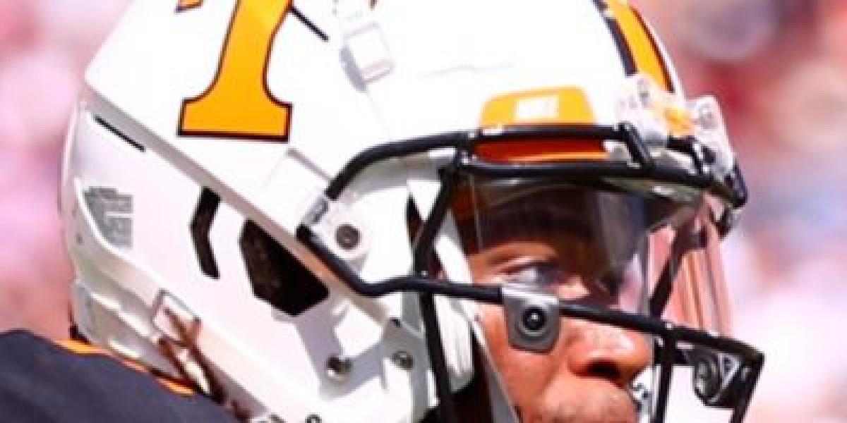
In the early days, simplicity reigned. From 1925 to 1950, a plain white shell adorned with a single orange stripe down the center served as the Vols' headwear. It was a modest symbol, yet it boldly declared their allegiance to the color that would become their trademark.
The 1950s ushered in a change. Orange numbers were added, emblazoned on either side, further strengthening the team's visual identity. But it wasn't until 1964 that the iconic "Power T" arrived, a bold black block letter emblazoned proudly on the helmet's crown. This symbol, designed by new coach Doug Dickey, instantly resonated with fans, solidifying the team's image as a force to be reckoned with.
The T wasn't static. Over the years, it underwent subtle tweaks, reflecting the changing aesthetic of the era. The stripe narrowed, then widened, the font adjusted, constantly searching for the perfect visual representation of Vol power.
In 2015, Nike entered the scene, bringing a bold rebrand. The Power T received a slight reshaping, gaining a modern edge, and the helmet sported a checkerboard design on the back, mimicking the Neyland Stadium end zone. This change sparked debate, some embracing the fresh look, others pining for the classic simplicity.
But one thing remained constant: the orange. Throughout the decades, from the white shell to the checkered accents, the vibrant orange has never wavered. It's a constant reminder of the Vols' fiery spirit, a beacon that shines even in the darkest of defeats.


