winklogo200.png

Football History

Dive into the Depths of College Football

The 1922 Rose Bowl
Celebrate 2 of the top Gridiron Coaches in history in the latest Pigskin Dispatch book

When Greasy Met the Wonder Coach

Greatest Pro Team
Who was the MOST DOMINANT team in Pro Football History? We have the answer in the latest Pigskin Dispatch book

The World's Greatest Pro Gridiron Team

FREE Daily Sports History
You are only seconds away from receiving the Pigpen's Newsletter everyday filled with new items

SUBSCRIBE BY CLICKING _________________________  

Dive into the Depths of College Football

Take a deep dive into the history and origins of the top gridiron teams and programs at the collegiate level. We celebrate the game of American football right from its roots. The concept started with youngsters of different schools competing against each other and the game at that level still thrives.

College football – a tapestry woven from roaring stadiums, electrifying plays, and passionate rivalries. But beyond the spectacle, lies the beating heart of the sport: the college football programs themselves. Each one, a unique ecosystem of tradition, strategy, and vibrant personalities, shaping the future of the game and inspiring generations of fans. In this series, we'll delve deep into these programs, exploring their storied histories, iconic figures, and the intricate dance of coaching philosophies and player development that shapes their triumphs and challenges. So, grab your jersey, settle in, and prepare to be swept away by the captivating world of college football programs, where legends are forged, dynasties built, and every Saturday becomes a battleground for gridiron glory!


Results 211 thru 220 of 366 for "College Football Programs"
Go To Page: 1 . . . . 18 19 20 21 22 23 24 25 26 . . . . 37

A Look at Penn State's Helmet History

The Penn State Nittany Lions are known for their iconic blue and white uniforms, but one element often goes unnoticed – the helmet. While seemingly simple, Penn State's helmet design has evolved subtly over the years, reflecting the program's history and tradition. This essay delves into the journey of the Penn State helmet, exploring how it transformed from an essential protective measure to a recognizable symbol of Nittany Lion pride.

The Early Days (1940s-1950s): Embracing Functionality

In the early years of Penn State football (1940s-1950s), helmets were primarily practical. As the leather helmets of the early days transitioned to hard plastic shells, the focus remained on player safety. The initial Penn State helmets were white, devoid of decals or markings. This minimalist approach reflected the general design philosophy of the era.

The Introduction of the Stripe (1957-Present): A Signature Emerges

1957, a defining element was introduced – the single blue stripe running down the helmet's center. This simple addition marked the birth of the Penn State helmet design that fans recognize today. The blue stripe mirrored the prominent stripes on the team's jerseys, creating a cohesive visual identity.

A Brief Experimentation (1957-1962): Numbers on the Sidelines

In the late 1950s and early 1960s, Penn State briefly deviated from the minimalist aesthetic. Inspired by other teams, it experimented with adding player numbers to the sides of the helmets. However, this design element only partially resonated with the program's identity and was discontinued after several seasons.

A Return to Simplicity (1962-Present): The Timeless Look

Since removing the player numbers in 1962, the Penn State helmet has remained remarkably consistent. The single blue stripe has become the cornerstone of the design, instantly recognizable and synonymous with the Nittany Lions. This commitment to tradition reflects the program's focus on timeless values – hard work, dedication, and a fighting spirit.

Beyond Design: A Symbol of Legacy

While the design has remained relatively unchanged, the Penn State helmet carries a significant weight of history. It has adorned the heads of legendary Nittany Lions like Franco Harris, John Cappelletti, and LaVar Arrington, becoming a symbol of excellence and tradition. It represents the unyielding spirit of the program, uniting generations of players, coaches, and fans under a shared identity.

A Look to the Future

Although the core design is unlikely to change drastically, subtle variations may exist. The introduction of alternate uniforms in recent years hints at the possibility of alternate helmet designs in the future. However, the classic white helmet with the single blue stripe will remain the cornerstone of Penn State's helmet history, a testament to the program's enduring legacy.

A History of Ohio Bobcats Helmets

The Ohio Bobcats football program, known for their fierce spirit and iconic mascot, boasts a helmet history as dynamic as their on-field play. Let's rewind and explore the evolution of this protective headwear:


Early Days (1894-1940s):


Leather Lids: In the early days, players donned simple leather helmets, often with a single stripe or the letter "O" painted on. These rudimentary designs reflected the nascent nature of organized football and lacked the flair of modern iterations.

Birth of the Bobcat (1940s-1960s):


Bobcat Debut: The official Bobcat mascot, a symbol of the university's athletic prowess, began appearing on helmets in the 1940s. Initially, stylized bobcat heads were painted or decaled onto the leather lids, adding a touch of personality to the uniform.

Evolving Stripes and Experimentation (1960s-1980s):


Green and White Domination: The classic green and white color scheme became prominent during this period. Stripes of varying widths and patterns adorned the helmets, with designs often mirroring the team's jerseys.
Experimentation and Innovation: Different helmet manufacturers and styles were explored, including the introduction of plastic shells and facemask designs that improved player safety and comfort.

The Charging Bobcat Emerges (1980s-Present):


Iconic Charge: The iconic "Charging Bobcat" logo, depicting a fierce bobcat in full stride, became the dominant helmet design in the 1980s. This powerful image resonated with fans and players alike, symbolizing the team's aggressive spirit and relentless pursuit of victory.
Modern Tweaks and Refinement: While the "Charging Bobcat" remains the core design, minor adjustments have been made over the years, such as refining the logo's details and color scheme. Additionally, alternate helmet designs have been introduced for special occasions, offering a fresh perspective while maintaining the essence of the classic Bobcat.

More Than Just Headgear:


The Ohio Bobcats' helmets are more than just protective equipment. They are symbols of tradition, pride, and the fighting spirit that defines the program. The evolution of their design reflects the program's own journey, from humble beginnings to modern-day success.


As the Bobcats charge onto the gridiron, their helmets are more than just headwear; they are a visual testament to the legacy of Bobcat football and a promise that the pursuit of excellence continues in every game.
So, the next time you see a green and white helmet adorned with a charging bobcat, remember the rich history and unwavering spirit it represents. It's a story of grit, triumph, and the enduring pride of the Ohio Bobcats.

A Century of Gridiron Glory

          The Story Begins 1893-  HORNS UP!! U.T. Campus 1895-  Road at bottom left is Guadalupe   — www.texaslsn.org

The video by TexasISN.com really gets you fired up, doesn't it?
With roots tracing back to 1893, the Texas Longhorns football program boasts a rich history steeped in tradition and punctuated by moments of brilliance. From humble beginnings to national championships and iconic players, the Longhorns have carved their name into the annals of college football.

-Early Days and Establishing a Legacy (1893-1946):
The early years were marked by a spirited journey, with the Longhorns facing limited resources but fueled by unwavering determination. Under coaches like E.J. "Doc" Steckel and Blair Cherry, the Longhorns built a reputation for grit and resilience, establishing themselves as a force to be reckoned with.

-Golden Era and National Championships (1947-1970):
The arrival of legendary coach Darrell Royal ushered in a golden era for the Longhorns. With Royal's innovative schemes and leadership, the program reached new heights. National championships in 1963 and 1969 cemented the Longhorns' status as a national powerhouse, while iconic players like Earl Campbell and Tommy Nobis became legends of the game.

-Continued Success and Defining Moments (1971-Present):
Despite facing challenges, the Longhorns continued to be a major force in college football. Vince Young's leadership in 2005 culminated in another national title, proving the program's ability to adapt and evolve with the times. Players like Ricky Williams and Colt McCoy continued to leave their mark, further enriching the Longhorns' legacy.

-More Than Just Wins:
Beyond their impressive record of wins and championships, the Longhorns are defined by their unique traditions and passionate fanbase. The iconic "Hook 'em, Horns" phrase, the majestic Bevo mascot, and the booming Smokey the Cannon are just a few symbols that bind generations of fans together.

-Looking Ahead:
As the Longhorns continue their journey in the ever-evolving landscape of college football, their unwavering spirit and commitment to excellence remain constant. With a rich history and a passionate fanbase, the Texas Longhorns football program is poised for continued success, leaving an indelible mark on the sport for generations.

A Helmeted History of Iowa Football

Nestled amidst the rolling plains of Iowa, the story of Hawkeye football isn't just about touchdowns and tackles; it's a visual odyssey etched onto the ever-evolving canvas of their helmets. From gleaming gold to iconic black and stripes, each design choice whispers a tale of tradition, rivalries, and the unyielding spirit that defines the Hawkeyes.

In the early days, simplicity reigned. Solid gold helmets adorned with black numbers reflected the Golden Age of Hawkeye football, a time of dominance marked by the legendary Forest Evashevski and his Rose Bowl-winning squads. This classic look evoked elegance and a sense of tradition, echoing the stoic resilience of the Iowa landscape.

But change, like the seasons, swept across the gridiron. In 1979, under the visionary coach Hayden Fry, the gold gave way to the now-iconic black and gold stripes, echoing the Pittsburgh Steelers' legendary uniforms. This reinvention wasn't just aesthetic; it signaled a new era of swagger and aggression, perfectly captured by the intimidating black stripes slicing through the gold.

And then came the Tigerhawk. Born from Fry's imagination, this stylized hawk's head, formed by the interweaving stripes, became an instant sensation. It was fierce, modern, and uniquely Hawkeye, roaring onto the national stage and instantly becoming a symbol of the program's identity.

But the Tigerhawk, like all symbols, wasn't immune to the winds of change. In 2010, a subtle tweak added a black outline to the hawk's head, emphasizing its predatory nature and sharpening its visual impact. This minor adjustment reflected the program's constant evolution, its pursuit of excellence unwavering through time.

Beyond aesthetics, the Hawkeye helmet has borne the scars of tragedy and resilience. In 1943, in honor of fallen Heisman Trophy winner Nile Kinnick, the left side of the helmet sported a single black number "24," a silent tribute that continues to evoke a pang of memory and pride.

And then there's the annual Cy-Hawk Trophy game, where the helmets transform into battlecries. Black and gold battle black and cardinal, stripes clashing and feathers snarling, each design emblazoned with the unwavering spirit of the rivalry.

The Iowa Hawkeye helmet is more than just a piece of headgear; it's a living testament to the program's rich history, its enduring grit, and its relentless pursuit of victory. From the gleaming gold of yesteryear to the fierce Tigerhawk of today, each design choice whispers a tale of tradition, evolution, and the unwavering Hawkeye spirit that forever pulsates beneath the black and gold.

A Journey Through Maryland's Sports Logos

Maryland Terrapins Logo PNG The evolution of the Maryland Terrapins logo is the way from a cluttered cartoonish logo to a more minimalistic and sleek one. Meaning and history 1970 Around 50 years ago, the emblem featured a tortoise in red, black, and white. The creature was standing on its rear paws, and his mouth — 1000logos.net

The University of Maryland, a bastion of athletic tradition, boasts a visual history as vibrant as its championship banners. Its sports logos, like ever-shifting tides, have mirrored the institution's evolution, reflecting changes in both identity and allegiance.

In the early days, Maryland teams proudly bore the nickname "Old Liners," a nod to the state's historical moniker. Their athletic emblems embodied this identity, often featuring a simple shield emblazoned with a crossed axe and plow – symbols of the state's agrarian roots.

Yet, by the 1930s, the "Old Liners" felt outdated. Enter the Terrapins, a nickname coined by then-football coach Harry C. "Curley" Byrd, inspired by the abundance of diamondback terrapins in the Chesapeake Bay. This sparked a visual transformation, with the first Terrapin mascot appearing in 1932 – a cartoonish turtle sporting a Maryland flag shell.

The 1960s and 70s saw a parade of Terrapin logos, some playful, others fierce. One featured a cartoon turtle balancing a basketball on its nose, while another sported a more aggressive profile, jaws open and ready to bite. These designs, while nostalgic, lacked the consistent identity a growing athletic program needed.

In 1988, the iconic "Maryland M" with the smiling Terrapin emerged. This design, with its bold stripes and playful yet determined mascot, struck a perfect balance between tradition and modernity. It became a ubiquitous symbol, adorning helmets, jerseys, and even buildings, cementing its place as the face of Maryland athletics.

Over the years, the logo has undergone subtle refinements, keeping it fresh while preserving its core identity. The 2012 iteration boasts a sleeker, more athletic Terrapin, reflecting the evolving nature of college sports.

Minnesota Golden Gophers Helmet Design History

The Minnesota Golden Gophers football program boasts a rich history and a passionate fanbase. While victories and iconic players are etched in memory, another element silently represents the team's identity – the helmet. This essay explores the evolution of the Minnesota Golden Gophers football helmet design, tracing its journey from a practical safeguard to a recognizable symbol of Gopher pride.

The Early Years (1872-1940s): Safety First

The early days of Gophers football (pre-1940s) mirrored the national trend. Helmets were primarily leather shells, designed to protect players from head injuries. These rudimentary helmets lacked any visual appeal, focusing solely on functionality.

A Touch of Maroon (1940s-1960s): A Simple Addition

The mid-20th century saw the introduction of the first true Gophers helmet design element – a single maroon stripe running down the center of the leather or early plastic shell. This simple addition marked a step towards a more distinctive look for the Gophers.

The Birth of the Double Stripe (1960s-Present): A Lasting Legacy

The most recognizable element of the Gophers helmet design, the twin maroon stripes, arrived in the 1960s. Replacing the single stripe, these bold stripes offered a more prominent visual identity. The clean lines and simple color scheme resonated with fans and players alike, becoming synonymous with the Gophers brand.

Material Advancements (1960s-Present): A Focus on Safety and Consistency

While the core design of the helmet (double maroon stripes) has remained consistent, the materials have undergone advancements. Leather gave way to plastic and eventually high-tech materials designed to maximize player safety. However, these advancements haven't altered the overall visual identity established by the double stripes.

A Symbol of Gopher Pride:

The Minnesota Golden Gophers football helmet design transcends mere protection. It's a symbol of pride for Gopher Nation, a visual representation of the program's fighting spirit and rich tradition. It unites generations of players, coaches, and fans under a shared identity.

The helmet design, colors, and logo of the Minnesota Golden Gophers have changed throughout the past century in amazing ways. Helmet History.com shares images of past Gophers helmets to help spawn memories of the proud Minnesota football tradition.

A Helmet History Odyssey

Coming in 2022 Honoring the bravery of Frank Dowsing Jr and Robert Bell, the first African-Amercian student-athletest to play on the varsity football team — www.helmethistory.com

The Mississippi State Bulldogs' football helmet design, like their team itself, has endured several transformations over the decades, each reflecting changes in team identity, trends, and a touch of maroon-and-gray swagger. Here's a journey through the Bulldogs' headgear:

Early Days (1949-1966): Starting with white helmets in 1949, MSU donned numbers for a brief period before sporting the "Flying M" logo from 1963-1966. This era was defined by classic simplicity, a time before the Bulldog spirit found its full visual roar.

The White and Maroon Shift (1967-1973): A switch back to white helmets with numbers (1967-1972) was followed by a return to the "Flying M" on maroon in 1973. This period saw experimentation, a search for the perfect canvas for the Bulldog identity.

The Interlocking MSU Era (1979-2008): In 1979, a defining moment arrived - the iconic interlocking MSU logo took center stage on the maroon helmet. This design solidified the team's brand, becoming a symbol of Bulldog pride and fierce competitiveness. It witnessed three SEC championships and countless memorable victories.

Silver Adornments and Glittering Experiments (2009-2019): The early 2010s saw silver trim and stripes added to the helmet, giving it a modern edge. But the core - the interlocking MSU - remained unchallenged. Matt chrome, matte finishes, and even a throwback "MS" logo made brief appearances, showcasing the Bulldogs' willingness to experiment while holding onto their signature element.

Present Day: Celebrating Tradition and Honoring Heroes (2020-Present): The current helmet design retains the timeless interlocking MSU with subtle tweaks like bolder outlines and slightly altered proportions.

Additionally, several alternate helmets have emerged, like the "maroon chrome" version and the 2023 throwback to the 1998 championship team's design. Special helmets honoring veterans and fallen coaches further showcase the Bulldogs' commitment to tradition and community.

A Look at the USC Trojans Helmet Design History

The glistening reddish colored helmets of the USC Trojans are a recognizable symbol of college football dominance. However, the road to this iconic design has been paved with leather, plastic, and a journey through various styles. This essay delves into the evolution of the USC Trojans football helmet, exploring how it has transformed from a practical piece of equipment to a prominent symbol of Trojan pride.

The Early Years (1888-1930s): The Dawn of Head Protection

In the early days of USC football (1888-1930s), head protection was a rudimentary affair. Players often wore simple leather helmets, primarily designed to prevent scalp injuries. These helmets lacked any sort of design or branding, focusing solely on functionality.

The Rise of the Single Bar (1930s-1940s): A Touch of Identity

The 1930s saw the introduction of the first true USC Trojans helmet design. A single, horizontal white stripe was painted across the leather crown, marking the initial attempt to incorporate the team's identity into the headwear. This simple design remained in use for over a decade, offering a glimpse of the Trojans' branding to emerge in later years.

The Era of Experimentation (1940s-1960s): Material and Design Shifts

The mid-20th century witnessed a period of experimentation for the USC Trojans helmet. Leather helmets were gradually phased out in favor of more protective materials like plastic. Design-wise, the Trojans explored various iterations. They briefly used a two-stripe design before settling on a single, wider cardinal red stripe in the 1950s. This era also saw the introduction of a white facemask, adding a touch of modernity to the helmet's overall look.

The Birth of the Trojan Helmet (1960s-1970s): A Trojan Warrior Emerges

The 1960s marked a pivotal moment in USC Trojans helmet history. Inspired by the growing popularity of helmet decals in college football, USC introduced a revolutionary design. A white Trojan warrior helmet, a simplified version of their logo, adorned the side of the helmet. This iconic image, instantly recognizable and synonymous with the Trojans, cemented its place as a permanent fixture.

Today that crimson glossy helmet with he iconic Trojan emblem in gold is a staple of recognition in Southern Cal lore.

Georgia Tech Yellow Jackets A Story of Helmets and Reinvention

The Georgia Tech Yellow Jackets' helmet design echoes the team's history, reflecting moments of innovation, tradition, and a constant drive to redefine themselves. Strap on your hard hat as we journey through the evolution of Tech's headgear:


Early Days (1892-1950s):

-Leather Lids: In the earliest years, players donned simple leather helmets, offering meager protection but lacking any visual identity.


-Yellow Experiment: In the 1930s, Tech briefly experimented with bright yellow helmets, a bold yet short-lived attempt to stand out.

-Maroon Monoliths: By the 1950s, the classic maroon helmet with a single white stripe emerged, a simple yet elegant design that became synonymous with the Yellow Jackets.


The Heisman Era (1950s-1960s):

-The "GT": Under legendary coach Bobby Dodd, the iconic interlocking "GT" logo made its debut on the maroon helmets, symbolizing Tech's commitment to both athletics and academics.

-Flying Forward: In 1962, amidst space exploration fervor, Tech embraced a helmet decal of a stylized yellow jacket in motion, nicknamed the "Flying Hokie" (though not an actual Hokie!). This dynamic design added a touch of futuristic flair.

-Return to Classics: By the late 1960s, the "Flying Hokie" was retired, and the simple "GT" logo continued to reign supreme, a testament to its timeless appeal.


Modern Evolution (1970s-Present):

-Stripes and Experimentation: In the 1970s, the maroon helmets saw occasional additions like multiple white stripes or a yellow border around the "GT" logo, showcasing a willingness to experiment while maintaining core colors.

Black Power Tribute: In 1971, Tech players wore black stripes down the center of their helmets in solidarity with the Black Power movement, a powerful demonstration of social awareness.

Present Day: Today, the Yellow Jackets retain the maroon helmet with the interlocking "GT" logo. Subtle variations, like matte finishes or alternate shade combinations, are occasionally introduced, allowing for modern touches without straying from tradition.

A Storied Canvas of Orange and Blue

From the sun-drenched plains of Urbana-Champaign to the gridiron battlefields nationwide, the Illinois Fighting Illini helmet has been a beacon of orange and blue, a canvas whispering tales of triumph and evolution. Its history, spanning over a century, is a testament to the program's shifting identity and enduring spirit.

In the early days, leather helmets ruled, bearing the simple inscription "Illinois" in a font echoing collegiate Gothic. They exuded a rugged charm, a testament to the sport's nascent brutality. As time marched on, plastic arrived, ushering in an era of experimentation. Single facemasks gave way to two, stripes danced between orange and white, and the iconic Block I, a symbol of strength and unity, found its rightful place on the side.

The 1970s brought a bolder era. The "Illini" moniker spanned the helmet in a dual white stripe, mirroring the team's fierce fighting spirit. Coaches experimented with matte finishes and alternative logos, seeking a distinctive visual identity. While some designs left marks, like the infamous all-orange nightmare of 1988, others, like the 1995 centennial helmets adorned with players' numbers, resonated with fans.

The 21st century ushered in a more streamlined approach. The Block I held center stage, its clean lines contrasting with the orange background. Subtle changes, like the introduction and subsequent removal of a blue facemask, reflected a desire for both tradition and modernization.

Recent years have seen a return to the classics. The iconic orange helmet, adorned with the Block I and two white stripes, remains the core identity. Yet, tweaks like the recent addition of a subtle blue outline to the stripes showcase the program's willingness to adapt while honoring its past.

More than just visual aesthetics, the Illini helmet embodies the program's heart. It whispers of Red Grange's electrifying runs, Dick Butkus' bone-crunching tackles, and Jeff George's laser-like throws. It echoes the cheers of Memorial Stadium on crisp autumn Saturdays, the pride of a passionate fanbase.

The Illini helmet is more than just headgear; it's a symbol of heritage, resilience, and the unwavering spirit of Illini football.
Results 211 thru 220 of 366 for "College Football Programs"
Go To Page: 1 . . . . 18 19 20 21 22 23 24 25 26 . . . . 37
Related Titles
1960 GOPHERS, A CENTURY OF HUSKY GRIDIRON GLORY, A DUEL IN THE DESERT, A GATOR GALLOP THROUGH TIME, A GOBBLING JOURNEY THROUGH TIME, A MARCH THROUGH TIME, A VISUAL EVOLUTION, AGGIE TRADITIONS, AGGIE UPSETS, AIR FORCE ACADEMY FALCONS FOOTBALL, AKRON ZIPS, AKRON ZIPS FOOTBALL, ALABAMA CRIMSON TIDE, ALABAMA CRIMSON TIDE'S TOP SEASONS, APPALACHIAN STATE MOUNTAINEERS, ARIZONA STATE SUN DEVILS, ARIZONA WILDCATS FOOTBALL, ARKANSAS RAZORBACKS, ARKANSAS STATE RED WOLVES, ASCENDING TO GRIDIRON GREATNESS, AUBURN TIGERS, AUBURN TIGERS' IRON BOWL MAGIC, BAYOU BLITZ, BULLDOGS UNCHAINED, CHARGING THROUGH HISTORY, COLLEGE BOYS TO NATIONAL CONTENDERS, COMMODORE CONQUEST, CORN HUSKERS GREATS, DAWG DAYS IN ATHENS, DAWGS THROUGH THE DECADES, DAWGS IN THEIR INFANCY, DEFINING MOMENTS, DUKE BLUE DEVIS MOST, EAGLES TAKING FLIGHT, FLORIDA ATLANTIC OWLS, FLORIDA GATORS 1911 SEASON, FLORIDA GATORS FOOTBALL, FLORIDA INTERNATIONAL GOLDEN PANTHERS, FROM AGGIES TO BULLDOGS, FROM BASIC BEGINNINGS TO BOLD BIRDS, FROM BLACK AND GOLD TO STRIPES OF GLORY, FROM BLUEGRASS ROOTS TO NATIONAL CONTENDERS, FROM BRAVES TO CHARGING MONARCHS, FROM BUGEATERS TO CHAMPIONS, FROM CARDINALS TO CHAMPIONS, FROM COLONEL REB TO LANDSHARK, FROM GATORS IN TRAINING TO COLLEGIATE CHAMPS, FROM GREEN LEATHER TO CHARGING GRIT, FROM HUMBLE BEGINNINGS TO FOOTBALL ROYALTY, FROM HUMBLE BEGINNINGS TO GRIDIRON GREATNESS, FROM HUMBLE BEGINNINGS TO HILLTOPPER HEIGHTS, FROM HUMBLE BEGINNINGS TO NATIONAL STAGE, FROM HUMBLE FIELD TO SWAMP SENSATION, FROM MONUMENT TO MAYHEM, FROM PALMETTO TO SPURS UP, FROM PRAIRIE TO GLORY, FROM SCRIBBLE ON A NAPKIN TO BIG ORANGE ICON, FROM SIMPLE STRIPES TO BIG RED FURY, FROM STARRY V TO BLOCK AND BOLD, FROM STOLL FIELD TO KROGER FIELD, FROM TERRAPIN SHELL TO FLYING TURTLE, FROM WILDCATS TO BOBCATS, GATOR GREATS, GATORS GRIDIRON GRAPHICS, GEAUXING FOR GREATNESS, GEORGIA BULLDOGS, GUIDING THE GOLDEN GOPHERS, HAIL TO THE HOWLING RED, HAWKEYE SKY, HAWKEYE TRIUMPHS, HAWKEYES SOARING HIGH, HILLTOPPER HEIGHTS, HOOSIER HAVEN, ILLINI HELMETS, ILLINI ILLUSIONS?, ILLINI THUNDER, ILLINOIS FIGHTING ILLINI, KENTUCKY WILDCATS, KENTUCKY WILDCATS FOOTBALL, KINNICK STADIUM, LSU TIGERS, LEGENDS OF THE ORANGE & BLUE, LOUISVILLE CARDINALS, MAROON AND WHITE MOSAIC, MARYLAND TERRAPINS, MEMORIAL STADIUM, MICHIGAN STATE SPARTANS, MICHIGAN WOLVERINES, MINNESOTA GOLDEN GOPHERS FOOTBALL LOGO, MISSISSIPPI STATE BULLDOGS, MORE THAN BRICKS AND BLEACHERS, NOTRE DAME FIGHTING IRISH, NUMBER 44, OHIO BOBCATS, OHIO STATE BUCKEYES, OLD DOMINION MONARCHS, OLD DOMINION'S FORTRESS, OLE MISS REBELS, OREGON DUCKS, PITT PANTHERS, RAZORBACKS RISE, REBELS RISING, REBELS WITH A TWIST, RED AND BLACK REIGN, ROCKY TOP RHYTHMS AND VOL WALK VIGOR, ROCKY TOP TRIUMPHS, SOARING THROUGH HISTORY, SOARING THROUGH TIME, SOARING VICTORIES, SOUTH CAROLINA GAMECOCKS, TENNESSEE FOOTBALL, TEXAS A&M FOOTBALL, TEXAS LONGHORNS, TEXAS LONGHORNS ALL-TIME STATISTICAL LEADERS, TEXAS LONGHORNS FOOTBALL, TEXAS TECH RED RAIDERS, THE 1966 DRAFT, THE ALABAMA CRIMSON TIDE'S BEST PLAYERS EVER, THE MAIZE AND BLUE REIGN SUPREME, THE POWERHOUSE BACKFIELD, THE SWAMP, THE UNCROWNED KINGS, THE UNTAMED 1960 BOBCATS, THROUGH GOLD, BLACK, AND STRIPES, THROUGH HELMETS AND HEADLINES, THROUGH ORANGE AND WHITE STRIPES, THROUGH STRIPES AND SOARING HAWKS, TOP MOMENTS IN OLD DOMINION MONARCHS FOOTBALL HISTORY, TROY TROJANS, UCF KNIGHTS, UCF KNIGHTS FOOTBALL, UNDER CRIMSON SKIES, VICTORIES THAT ECHO ACROSS THE DESERT, WASHINGTON HUSKIES, WESTERN KENTUCKY HILLTOPPERS, WILDCAT PROWESS, WINDY CITY CROSSROADS, WYOMING COWBOYS FOOTBALL
Related Categories
COLLEGE FOOTBALL PROGRAMS, COLLEGE FOOTBALL PROGRAMS PAST MAJOR SCHOOLS TEAMS, ABOUT SPORTS, FOOTBALL EQUIPMENT, COLLEGE FOOTBALL MASCOT ORIGINS, COLLEGE CONFERENCES, FOOTBALL HALL OF FAME, FOOTBALL HISTORY
Related Searches
altcategory:College HOF, altcategory:Football Legend, altcategory:Football Archaeology, altcategory:Football History, football:scandals, altcategory:About Sports, altcategory:College Football, Conference:SEC, Conference:ACC, Conference:Big 10, Conference:Big 12, sports:football, sports:college football, Conference:AAC, ASU Sun Devils, Conference:PAC 12, Conference PAC 10, Tempe, The Big House, altcategory:Football, altcategory:Coaches, Conference:Independent, Conference:MAC, football:Western Pennsylvania, football:Mascot Origins, college football:Conferences, altcategory:NFL Teams, football:Heisman winner, football:jersey history, sports:college Football, Conference:Sun Belt, football name:Fransinkwich, school:Vanderbilt University, Conference:Conference USA, Arizona Stadium, Conference:PAC-12, University of Arizona, school:Troy University, Roll Tide, University of Alabama, school:Syracuse University, football:NFL Draft, App State, Kidd Brewer Stadium, University of Oregon, Author:Len Ferman, Bevo, Hook 'em Horns, Conference:Mountain West, stadium:Falcon Stadium, Fielding H Yost

Orville Mulligan: Sports Writer
We invite you to take a ride through 1920's sports history in the audio drama that takes the listener through the sounds and legendary events of the era through the eyes of a young newspaper journalist. You will feel like you were there! Brought to you by Number 80 Productions and Pigskin Dispatch _________________________

Proud to Support The Professional Football Researchers Association
To learn more about joining the fun in preserving football history go to The Official PFRA Website. _________________________
We have placed some product links on this page. If you purchase by clicking on them, we will get a commission to use to help with operating costs.

Sports Jersey Dispatch
If you like remembering players of the NFL by their numbers then you may also enjoy going uniform number by number in other team sports as well. We have it for you on our other website in baseball, basketball, hockey and more on the Sports Jersey Dispatch. _________________________

Sports History Network
A Proud Partner in the Headquarters of Sports Yesteryear, SHN. _________________________

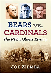
Bears versus Cardinals: The NFL's Oldest Rivalry
Author Joe Ziemba the master historian of football in Chicago has released another beauty. It is titled Bears versus Cardinals: The NFL's Oldest Rivalry. _________________________