Early Days (1931-1937):
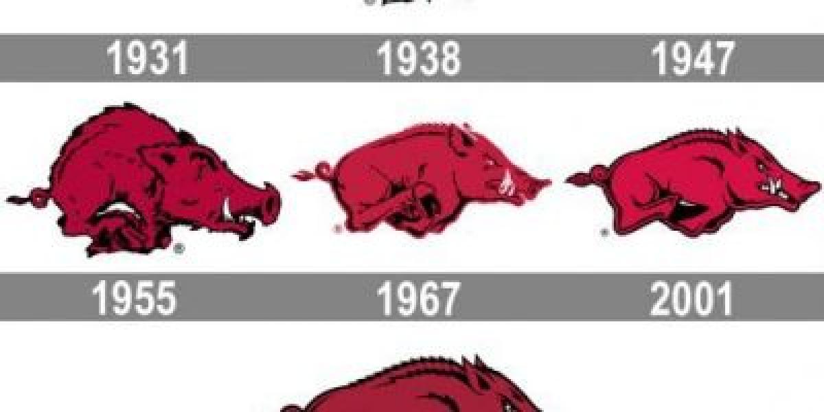
✦ The inaugural Razorback logo debuted in 1931, featuring a red hog running to the right with bold black details.
✦ This fierce-looking design, reminiscent of a cartoon character, embodied the program's aggressive spirit.
Evolution and Refinement (1938-1966):
✦ The hog underwent gradual tweaks over the years, becoming stronger and more aerodynamic in the 1940s, with white replacing some black accents.
✦ This period saw a shift towards a more streamlined visual identity.
The Cardinal Hog Era (1967-Present):
✦ In 1967, the iconic cardinal red hog we know today arrived. This sleek and modern design, with smooth lines and sharp highlights, became synonymous with the Razorbacks.
✦ While minor adjustments have been made, like tweaking the red shade and refining details, the core design has remained remarkably consistent.


