

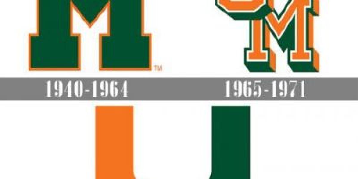
Early Beginnings (1920s-1950s): The Hurricanes' logo wasn't always the "U." In their early years, the program used various designs, including a simple "M" and an image of a hurricane. However, none resonated quite like the "U" that would eventually become their trademark.
The Birth of the "U" (1950s): The exact origin of the "U" remains unclear. Some credit Lee Majors, a sports publicist, who supposedly sketched it on a napkin in the 1950s. Others attribute it to university officials who saw the letter as a bold and recognizable symbol.
Evolution and Refinement (1960s-1990s): The "U" initially appeared in various fonts and styles. It wasn't until the 1970s that the now-familiar, blocky "U" with rounded corners began to take shape. This bolder design better reflected the program's growing toughness and physical style of play.
The Rise of "The U" and Controversy (1980s-2000s): The arrival of head coach Howard Schnellenberger in the early 1980s cemented the "U" as a national symbol. He embraced the logo's simplicity and power, using it in aggressive marketing campaigns. However, the logo also became associated with negative stereotypes about Miami's "swagger" and "thug" image.
The Modern Era (2000s-Present): The Hurricanes have strived to balance the tradition of the "U" with a more nuanced image in recent years. While the logo remains central to their identity, the program has incorporated secondary logos and emphasized sportsmanship and academics.
Symbolism and Legacy: The "U" transcends a simple letter. It embodies the Hurricanes' fighting spirit, resilience, and dedication to excellence. It has become a rallying cry for fans and a symbol of Miami's vibrant culture.