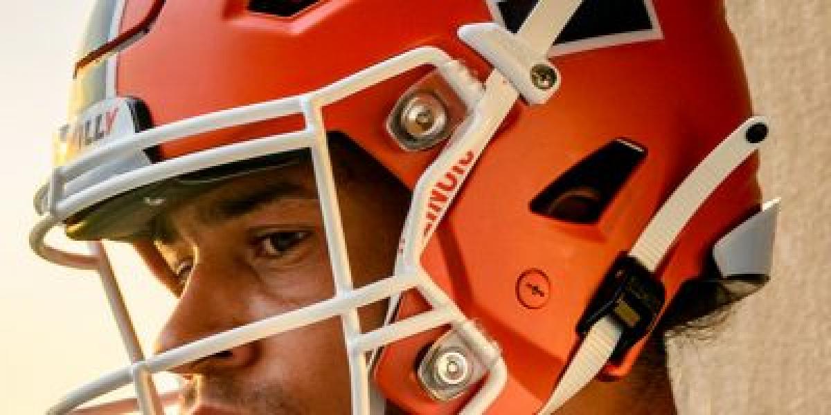
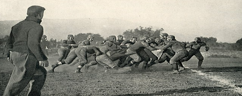
In the early days, leather helmets ruled, bearing the simple inscription "Illinois" in a font echoing collegiate Gothic. They exuded a rugged charm, a testament to the sport's nascent brutality. As time marched on, plastic arrived, ushering in an era of experimentation. Single facemasks gave way to two, stripes danced between orange and white, and the iconic Block I, a symbol of strength and unity, found its rightful place on the side.
The 1970s brought a bolder era. The "Illini" moniker spanned the helmet in a dual white stripe, mirroring the team's fierce fighting spirit. Coaches experimented with matte finishes and alternative logos, seeking a distinctive visual identity. While some designs left marks, like the infamous all-orange nightmare of 1988, others, like the 1995 centennial helmets adorned with players' numbers, resonated with fans.
The 21st century ushered in a more streamlined approach. The Block I held center stage, its clean lines contrasting with the orange background. Subtle changes, like the introduction and subsequent removal of a blue facemask, reflected a desire for both tradition and modernization.
Recent years have seen a return to the classics. The iconic orange helmet, adorned with the Block I and two white stripes, remains the core identity. Yet, tweaks like the recent addition of a subtle blue outline to the stripes showcase the program's willingness to adapt while honoring its past.
More than just visual aesthetics, the Illini helmet embodies the program's heart. It whispers of Red Grange's electrifying runs, Dick Butkus' bone-crunching tackles, and Jeff George's laser-like throws. It echoes the cheers of Memorial Stadium on crisp autumn Saturdays, the pride of a passionate fanbase.
The Illini helmet is more than just headgear; it's a symbol of heritage, resilience, and the unwavering spirit of Illini football.


