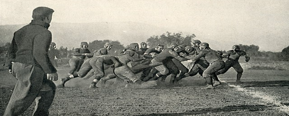
Early Days: A Time of Transition (1890s-1940s)
The early years of Wisconsin football (1890s-1940s) lacked a singular, official logo. Teams often used generic designs or variations of the university seal for branding purposes. Live badgers, the program's mascot since 1893, even made occasional appearances at games, proving to be a bit too "spirited" for long-term viability.
The Rise of the 'W' (1940s): A Symbol Emerges[b]
The need for a cohesive visual identity grew in the 1940s with the rise of college football merchandising. In 1940, artist Art Evans designed the now-iconic "W" logo, featuring a bold cardinal red letter with a clean white border. This simple yet powerful design mirrored the "Block W" logo adopted by the university around the same time. The "W" resonated with fans and players alike, offering a clear and recognizable symbol for the Badgers brand.
[b]A Commitment to Consistency (1940s-Present): The Power of Simplicity
The brilliance of the Wisconsin Badgers logo lies in its enduring simplicity. Unlike other programs that have undergone frequent logo revisions, Wisconsin has remained committed to this singular design. This consistency has allowed the logo to become a timeless symbol, instantly recognizable and synonymous with the program's rich tradition.
[b]Beyond the Logo: A Badger's Spirit[b]
The Wisconsin Badgers logo embodies the fighting spirit of the program, the unwavering dedication of its players and coaches, and the passionate loyalty of its fanbase. It's a symbol that unites generations of Badgers under a shared identity, a source of pride that resonates throughout Camp Randall Stadium on game days.


