Early Days (1890s-1940s):
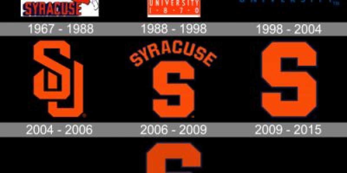
✦ The program initially adopted a script "Syracuse" logo with orange and white lettering, reflecting the university's colors.
✦ Later variations incorporated simpler designs, including a block "S" and a bold orange block letter "U."
✦ These early logos lacked the mascot imagery that would later define the program's identity.
The Birth of Otto (1940s-1980s):
✦ In 1946, the iconic orange block "SU" logo with a white outline emerged, marking a significant shift.
✦ This design, nicknamed "The Block Syracuse," became the program's primary logo for decades.
✦ The 1980s saw the introduction of Otto the Orange, a playful cartoon mascot, but he initially played a secondary role behind the "Block Syracuse" logo.
Modern Evolution and a Bold New Brand (1980s-Present):
✦ The late 1980s witnessed the rise of Otto, gradually taking center stage. A more spirited and athletic version of the mascot replaced the cartoonish design.
✦ In 2006, a major rebranding introduced a sleek, stylized "S" logo, incorporating an orange silhouette of Otto within the letter.
✦ This modern "Interlocking SU" logo remains the program's primary mark, representing a balance between tradition and dynamism.


