Early Days (1908-1971):
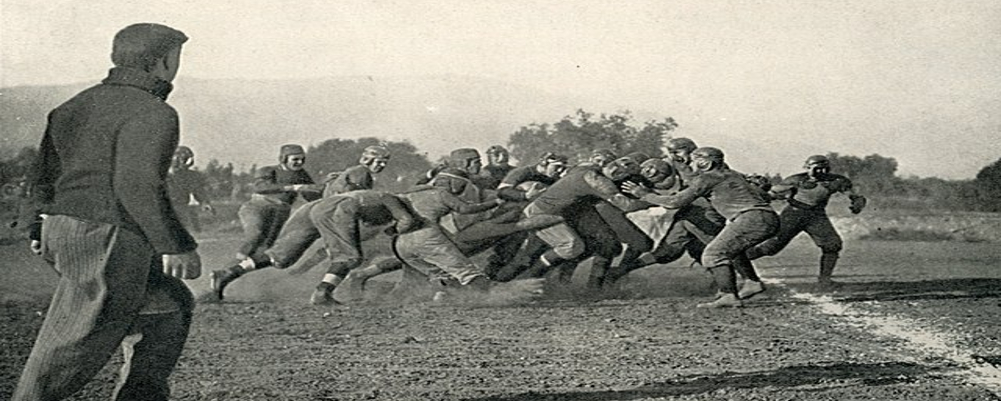
In the program's infancy, logos were rudimentary. An "OHIO VALLEY" banner graced early equipment, while simple lettering or mascots adorned jerseys.
The iconic Hilltopper nickname emerged in the 1920s but wasn't officially adopted as the mascot until 1951.
The Red Flag Era (1971-2000):
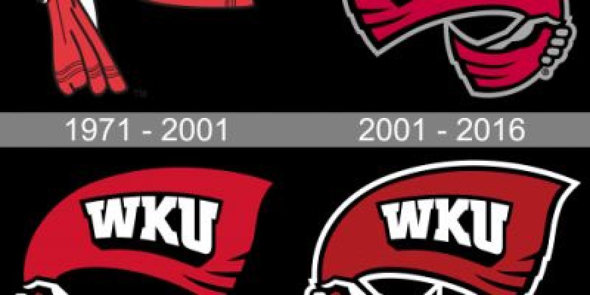
Former Hilltopper John Oldham designed the now-classic logo in 1971. A white hand held a fluttering red flag bearing the bold letters "WKU" in a geometric serif font.
This dynamic image embodied the team's fighting spirit and became synonymous with Hilltopper football, representing countless victories and milestones.
Evolution and Experimentation (2001-Present):
The new millennium ushered in a period of logo adjustments. The serif font transformed into a cleaner sans-serif style, and the flag lost its fluttering lines.
Further refinements saw the hand change position and the red shade deepen. Alternate logos featuring a stylized Hilltopper head emerged briefly.
The Red Towel Takes Center Stage (2017-Present):
In 2017, a new era dawned with the introduction of the "Red Towel" logo. Inspired by the iconic WKU tradition of waving red towels during games, the design features a bold, diagonal "W" and a dynamic Hilltopper head within a waving red towel.
This modern evolution retains the program's core identity while reflecting its vibrant spirit and passionate fanbase.
More Than Just Aesthetics:
WKU's logo history is more than just artistic changes. Each design captures a snapshot of the program's journey, highlighting the unwavering spirit of the Hilltoppers. From the classic red flag to the dynamic red towel, every iteration carries the legacy of hard-fought victories, passionate fans, and the unwavering pursuit of gridiron glory.


