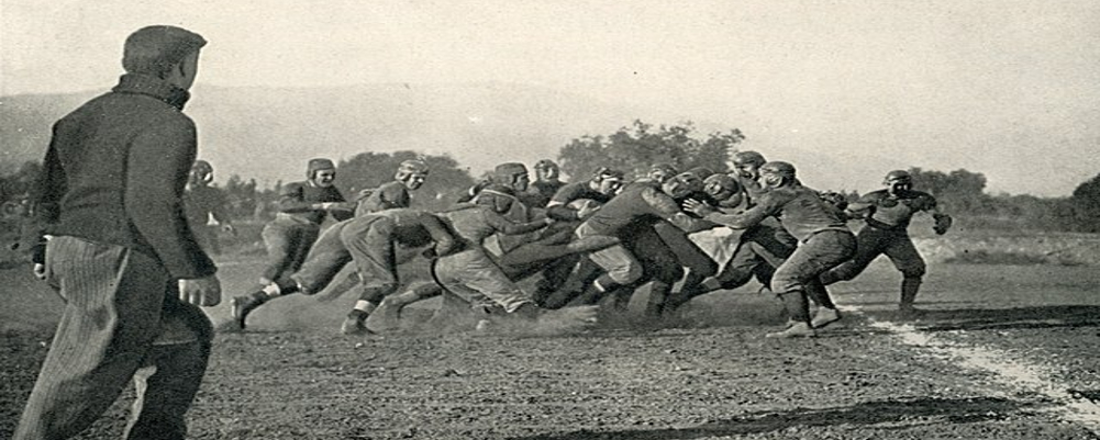
In the Beginning (1892-1963):
✦ Early helmets lacked a consistent design, often featuring simple leather caps or rudimentary leather helmets devoid of logos.
✦ The iconic red and black color scheme emerged around 1906, adding a splash of Georgia spirit.
The Birth of the "G" (1964-Present):
✦ 1964 saw the arrival of the now-legendary "G" logo, designed by artist Anne Donaldson. Its clean lines and bold presence instantly resonated with fans.
✦ The "G" wasn't simply a logo; it represented the program's grit, determination, and unwavering pride.
Variations on a Theme:
✦ While the "G" has remained the constant element, the helmet design has seen subtle refinements over the years.
✦ Different shades of red have been used, the helmet size and shape have evolved, and subtle details like outlining the "G" have been added and removed. Our friend Randy Snow has a great explanation of why Georgia's "G" looks so much like the Green Bay Packers and Grambling's headgear.
[iframe]https://youtu.be/Pf5jVyvTs9E[/iframe]
Special Editions and Alternate Helmets:
✦ Georgia embraces the tradition of alternate helmets, showcasing variations like matte black lids for rivalry games or helmets adorned with commemorative decals.
✦ These variations pay homage to specific traditions, honor fallen players, or create a unique look for marquee matchups.
No pun but it is a Dog Eat Dog competition for mascot names sometimes.
Join us for more fun as we examine the origins of team and school mascots here on Pigskin Dispatch, your portal to Positive football history.


