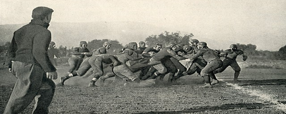
In the golden age of Hawkeye football, under the legendary Forest Evashevski, helmets gleamed in solid gold – a symbol of elegance and a reflection of the Hawkeyes' unwavering spirit. This classic look, adorned with black numbers, captured the stoic resilience that defined both the team and the Iowa landscape.
But change, much like the changing seasons, swept across the gridiron. In 1979, Coach Hayden Fry, a man of vision and swagger, ushered in a new era. The gold gave way to bold black and gold stripes, mirroring the Pittsburgh Steelers' dominant uniforms. This shift wasn't just aesthetic; it was a declaration of a new Hawkeye identity – aggressive, modern, and ready to roar.
And then came the Tigerhawk. Fry's brainchild, this stylized hawk's head formed by the interweaving stripes, instantly soared into fame. It was fierce, modern, and uniquely Hawkeye, instantly becoming a national sensation and etching itself as the program's defining emblem.
But the Tigerhawk, like all symbols, wasn't immune to evolution. In 2010, a subtle black outline sharpened its gaze, adding a touch of predatory intensity. This minor adjustment reflected the program's constant pursuit of excellence, its refusal to rest on past laurels.
Beyond aesthetics, the Hawkeye logo has borne the scars of tragedy and resilience. On the left side of the helmet, a single black number "24" - a silent tribute to fallen Heisman Trophy winner Nile Kinnick – evokes a pang of memory and reinforces the unyielding Hawkeye spirit.


