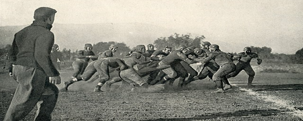
Early Days (1890s-1950s): A Patchwork of Symbols
Pre-dating a unified logo, early teams wore jerseys adorned with various lettering and symbols, reflecting the nascent stage of collegiate sports branding. Script "O"s, interlocking "OS"s, and even buckeye leaves made cameos.
Birth of the Block O (1950s-1970s): A Scarlet Icon Emerges[/]b
In 1953, the now-legendary Block O debuted, solidifying its place as the primary logo. Inspired by the university seal, it captured the essence of "Ohio" while echoing the athleticism and strength of the team. Simple yet impactful, it cemented its brand recognition over the next two decades.
[b]Framing the O (1970s-1980s): Adding Layers of Identity
The 70s saw the Block O adorned with double borders, first white and black, then black and black. This subtle evolution aimed to enhance visibility and add a touch of dynamism. In 1987, the logo underwent a significant change with the addition of the words "Ohio State" below the O. This marked a shift towards emphasizing the university's identity alongside the iconic symbol.
Modern Refinement (1990s-Present): Keeping the Legacy Alive
The 90s saw minor tweaks to the font and spacing of the lettering, aiming for improved readability and a more contemporary feel. The core design, however, remained firmly rooted in its Block O heritage. More recently, variations such as a chrome O and a script "Ohio State" have emerged for specific uses, showcasing the logo's adaptability while preserving its essence.
Beyond the Logo: A Symbol of Buckeye Spirit
The Block O transcends mere graphic design. It embodies the unwavering spirit, passion, and legacy of the Ohio State Buckeyes football program. Worn by generations of players, coaches, and fans, it represents a shared history and the pursuit of excellence. As the team marches forward, the Block O remains a timeless emblem, serving as a constant reminder of the rich tapestry woven by Buckeye pride.


