From Sun Dodgers to Huskies (1900s)
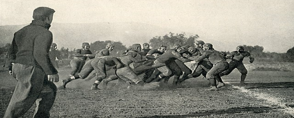
In the early days, the Huskies' athletic teams went by the name "Sun Dodgers." Reflecting this, the first recorded logo in 1919 depicted a man standing under an umbrella, facing away from the sun. This historically significant logo lacked the ferocity and spirit that would later define the Huskies.
The shift to "Huskies" as the official mascot in 1922 ushered in a new era of visual representation. The iconic "W" logo was introduced in 1924, featuring a bold serif font and a classic block design. This simple yet powerful symbol quickly became synonymous with Husky athletics and has remained constant.
Modern Adaptations and Variations (1900s onwards)
While the "W" remained the centerpiece, the logo underwent several stylistic changes. In the 1950s, bolder fonts and playful designs emerged, reflecting the changing aesthetic of the time. The 1959 logo, for example, featured a whimsical Husky mascot alongside the "W," offering a more lighthearted representation.
By the 1980s, a more modern approach was adopted. The 1983 logo featured a sleek, sans-serif font for the "W," set against a contrasting blue and white background. This streamlined design emphasized the power and strength of the Huskies brand, reflecting the program's growing national prominence.
The 21st century saw further refinements to the logo. The 2001 iteration introduced a subtle gradient effect to the "W," adding depth and dimension. This version and the 2016 logo featuring a bolder, more aggressive font solidified the Huskies' visual identity in the modern era.
A Legacy in Purple and Gold
Today, the Washington Huskies logo is a testament to the program's rich history and enduring legacy. With its simple yet powerful design, the "W" symbolizes excellence, representing generations of talented athletes and passionate fans. As the Huskies forge their path in college football, their iconic logo will undoubtedly remain a cherished emblem for years.
Check out the logos and more at the 1000logos.net link below.


