Early Days (1909-1981):
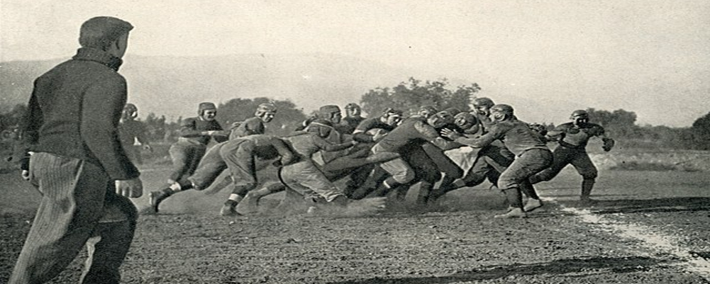
1909-1924: Before the official Eagles nickname, early teams like "The Culture" sported various unofficial logos, often incorporating the school colors of blue and white.
1924-1981: The "Blue Tide" era saw the introduction of a simple blue and white "GS" monogram, sometimes accompanied by a wave or a sailor's hat, reflecting the university's location near the coast.
The Erk Russell Era and Rise to Prominence (1982-2010):
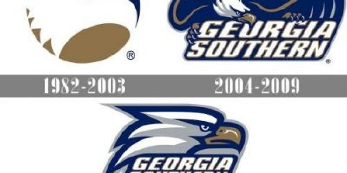
1982-1999: Enter the iconic "Eagle Head" logo, introduced under Coach Erk Russell. This stylized eagle, with its sharp beak and piercing gaze, symbolized the Eagles' newfound dominance in I-AA.
1999-2010: A slight modernization saw the eagle head adopt a more dynamic pose, with its wings spread and feathers flowing, conveying a sense of power and movement.
Transition to FBS and Modern Era (2011-Present):
2010-2016: As the Eagles set their sights on the FBS level, the logo evolved again, featuring the full eagle body perched atop the team name in a bold, modern font. This design emphasized the team's identity and unity.
2016-Present: The current logo represents a return to the eagle head, now rendered in a more detailed and three-dimensional style, capturing the bird's fierceness and determination. This design incorporates subtle nods to the program's history, like the blue and white stripes on the neck.


