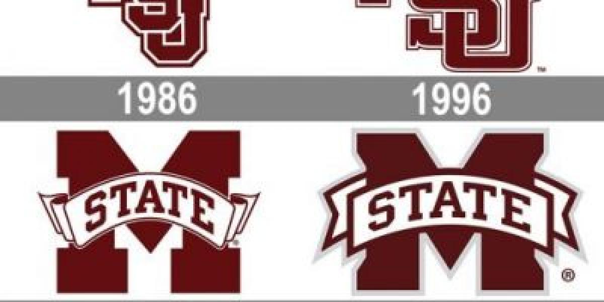
Early days saw the Bulldogs represented by a simple "MS" monogram, a symbol of unity and tradition. Soon, a roaring bulldog joined the fray, embodying the team's fierce competitive spirit. The 1960s witnessed the "Flying M," a dynamic, aerial depiction symbolizing a team on the rise.
A period of experimentation followed, with interlocking "MSU" logos and simplified bulldog heads adorning helmets. Yet, a sense of disconnect lingered. Fans craved a unified, impactful emblem that captured the essence of Bulldog football.
The answer arrived in 1996, with the introduction of the current "M-State" logo. It was a stroke of genius, combining the iconic maroon letter "M" with a stylized bulldog head. The design was bold, modern, and undeniably recognizable. It screamed "Mississippi State" in every line and curve.
But the story doesn't end there. The "M-State" logo didn't just represent a football team; it became a rallying point for the entire university community. Students, alumni, and fans proudly donned the emblem, solidifying its place as a symbol of Bulldog pride.
Today, the "M-State" logo continues to evolve, with subtle alterations reflecting the times while preserving its core identity. It adorns everything from helmets to t-shirts, reminding everyone of the legacy, the passion, and the unwavering spirit of Mississippi State football.


