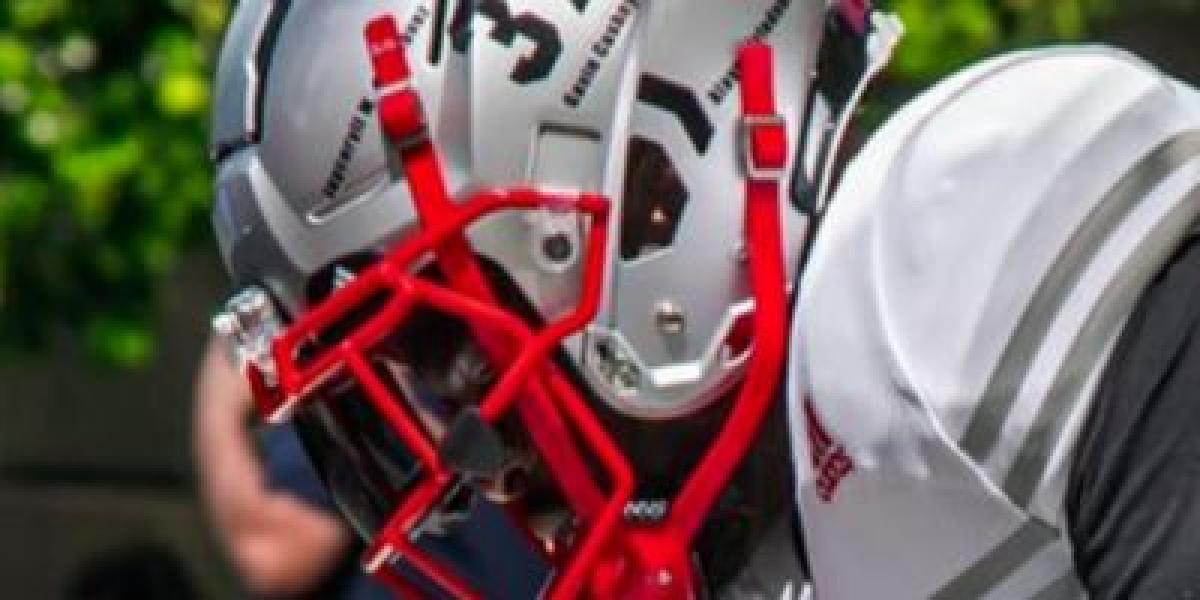
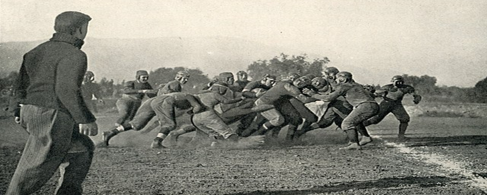
Early iterations of the Rutgers helmet were simple, often featuring a plain scarlet hue with minimal adornments. As the sport evolved, so too did helmet design, with the introduction of stripes and numbers becoming commonplace. Rutgers experimented with various stripe patterns and number placements, searching for a look that would become iconic.
A defining moment in the helmet's history arrived in the 1980s when the Scarlet Knights boldly opted to replace the traditional logo with the full word "Rutgers" across the helmet. This unique approach garnered attention and established a distinctive identity for the program. While the "Rutgers" helmet became synonymous with the team for nearly two decades, it eventually gave way to a desire for a more modern look.
The early 2000s brought a fresh era for Rutgers football, marked by a resurgence under coach Greg Schiano. This revitalization extended to the team's visual identity, including the helmet. The "R" logo, a bold and simplified representation of the university's name, was introduced and quickly became an emblem of the program's renewed vigor.
In recent years, Rutgers has continued to refine its helmet design while staying true to its core identity. Variations of the "R" logo have been explored, and the Scarlet Knights have occasionally experimented with alternate helmet colors and patterns for special occasions. However, the fundamental design featuring the "R" logo has remained consistent, serving as a recognizable symbol for the program.
The evolution of the Rutgers Scarlet Knights helmet mirrors the team's journey through the decades. From humble beginnings to iconic designs and modern refinements, the helmet has played a role in shaping the program's identity and connecting with its fans.


