The Early Years (1920s-1940s): Birth of the Bruin
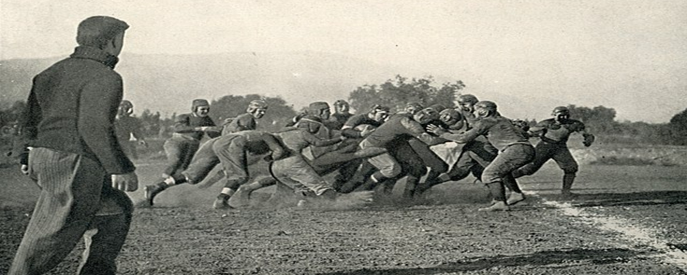
The UCLA Bruins adopted their mascot in 1929, replacing the previous "Golden Cubs" moniker. The first logo, designed in the same year, featured a simple cartoon bruin with a determined expression, charging forward. This logo, reminiscent of early sports mascots, lacked the detail and refinement seen in later iterations.
The Mid-Century Modern Era (1950s-1960s): Refining the Image
The 1950s ushered in a period of modernization for the UCLA logo. The bruin's form became more athletic and streamlined, with a dynamic running pose. The linework became sharper, reflecting the mid-century modern design aesthetic. This logo remained in use with minor variations for several decades, solidifying itself as a recognizable symbol of UCLA football.
The Bruin Takes Center Stage (1970s-1990s): A Focus on the Mascot
The 1970s and 1980s saw a shift in focus towards the mascot itself. The logo became more minimalist, featuring a close-up of the bruin's head with a fierce expression. The blue and gold color scheme, synonymous with UCLA, became more prominent. This era's logo aimed for a more intimidating and powerful image, reflecting the team's growing competitive spirit.
The Modern Era (2000s-Present): Maintaining Tradition with a Touch of Style
The current UCLA Bruins logo, introduced in 2002, maintains the essence of the previous iterations while incorporating modern design elements. The overall shape became slightly more rounded, and the bruin's face is presented at a three-quarter view. The color scheme remains consistent, but the lines are more refined, giving the logo a sleeker and more contemporary look.
Beyond the Logo: A Symbol of Excellence
The evolution of the UCLA Bruins logo reflects the program's journey. From a simple cartoon to a refined and powerful image, the logo has mirrored the team's rise to national prominence. More importantly, it embodies the core values of UCLA football – determination, athleticism, and a fighting spirit.


